A few years ago I co-wrote a whitepaper full of tips for nonprofits releasing reports to the press. A report about reports, so meta! But that was only the beginning.
I’ve helped push out about a dozen reports since then and I have New Wisdom to share. Do you want to know how to make a report pique a reporter’s interest? Or what ingredients you need to help turn the sometimes complicated contents of your report into an actual news story that real people read? Read on, friends.
It’s Called a ‘Hook’ for a Reason
The things we hear most often from reporters and opinion editors is a desire for a unique point of view or story angle. In some cases, you might present that perspective through a pitch or a briefing with a reporter, but you can also do it through a report.
Reports work when you can dive deep and nerd it up to offer something unique. Find the issue that you work on that no one is covering, or even knows exists — that’s a good place to start!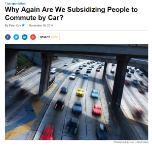
We recently helped TransitCenter push out a report called “Subsidizing Congestion” which raised the question: Why is the federal government paying workers more for commuter parking than commuter public transit?
Parking: boring. Government subsidies: snooze. But together, the report told a powerful story from a fresh perspective, all backed up by solid data. The report was picked up in outlets like Bloomberg Businessweek, Politico, Chicago Tribune, and the Houston Chronicle, among others. TransitCenter’s eye-opening and head-tilting argument was the selling point for press. We also took advantage of our report’s timeliness — Congress was in the middle of budget talks so reporters were looking for new hooks to tackle the budget.
Make it Dynamic, Dammit!
I see lots of pressworthy reports that look at an exciting issue but don’t present the data in an easy-to-digest fashion. Dense and nondigestible reports are a big buzzkill for reporters who tend to be super busy and have short attention spans. You’ve got someone starving for interesting and relevant content, eager for something easy to consume, and then you hand them a pineapple. They’re not going to bother with a giant spiky complicated thing when there are easier morsels all around.
So do yourself — and most importantly, the reporters you want to work with — a favor. Make sure that your key data points are actually interesting and really pop.
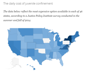
What does that look like? Last year we led the rollout of the Justice Policy Institute’s report, “Sticker Shock: Calculating the Full Price Tag for Youth Incarceration,” which calculated just how much it costs to lock up a kid. (The one-sentence version: in the long-term, incarcerating young people would cost taxpayers $8 billion to $21 billion each year. Equal parts depressing and outrageous, right?).
The report had tons of information. But what made the report dynamic was how easy it was to extract that information. Reporters could dive into the data and easily find estimates of a juvenile’s lost future earnings and the government’s lost revenue through taxes.
Another bonus about having a ton o’ dynamic data? News outlets will frequently take it and create cool infographics like this interactive map the Washington Post made (for free!).

While it wasn’t a report in the traditional sense, another good example of dynamic data in action was our effort to leverage satellite images of Syria in darkness for the #WithSyria coalition, timed to the 4-year anniversary of the conflict. The powerful image brought to life the stat that 83% of the country has plunged into darkness.
This report showed — not told — the story of the daily struggles of Syria’s citizens and helped ensure that those struggles were not overlooked in news coverage in outlets like the New York Times, Los Angeles Times, BuzzFeed, Quartz, and TIME around the somber anniversary.
Like Dylan Said, Bring It All Back Home
Having dynamic data is great, but the more you are able to localize your reports — especially reports that looks at an issue nationwide — the more coverage you’ll see. That’s because local, state, and regionally based reporters often require information specifically tailored to their area.
When we helped push out Oxfam America’s study, “Working Poor in America,” which looked at the positive impact of a $10.10 minimum wage, sure we secured national coverage in outlets like the Washington Post, Wall Street Journal, U.S. News & World Report.
But national coverage isn’t everything — we also got valuable state-based coverage across the country in outlets that mattered to the campaign like the Fresno Bee, Orlando Sentinel, Bangor Daily News, and the Epoch Times. Depending on your media strategy, these hits might be even more valuable.
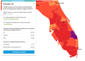
The beauty of Oxfam America’s study is they were able to show the impact of a $10.10 minimum wage for every congressional district in the country. This not only made their study hyper-localized, it also carried a lot more weight, since Members of Congress are very sensitive to news coverage in their home districts.
If a report lands on a reporter’s desk…
… but it’s too wonky, opaque, complicated, and irrelevant to earn coverage, does it even make a sound? (Yes, the sound of an organization’s frustrated cries when nobody pays attention.)
You can do better. The next time your nonprofit is thinking about pushing out a report, remember to always present a eye-opening argument, use a dynamic data set, and when possible localize that data so reporters can tailor it to their area. That’s how you get a reporter to look at and write about your report.
Looking to pique a reporter’s interest? M+R's got 3 tips to get some quality #media attention: https://t.co/YiETb7Cq7J #nptech
— M+R (@MRCampaigns) October 28, 2015