
 By Aaron Eske
 It’s an old trick gamblers use to look like high rollers: take a nice crisp $100 bill, and wrap it around a big fat wad of singles. That basically describes the traditional and only approach nonprofits have had to analyze their media metrics. You tally up the sheer number of media hits or impressions you got last year (even the meh outlets), wrap it up in a shiny clipbook for your board, and count quantity over quality.
You know it’s not a great system but hey, it’s how it’s always been done and you’re stuck with it until someone else figures out a way to get around it. We’ve been wrestling with a better way for a few years. I have actually woken up at 3am and not been able to get back to sleep once I hopped aboard a media metrics train of thought.
The tossing and turning was worth it. We have landed on a new system that’s working and I want to share it with you so your media reports can also be more worthwhile.
Using the new system, your annual media audits can tell you the real story of the outcomes your media outreach achieved. They can also give you the insights you need to reshape your media strategy and get greater press next year. You can do so much more once you know the answers to questions like…
- Are you getting media hits in outlets the audiences you need to reach are reading or watching?
- Which type of media outlet are you scoring or lacking at?
- Is your nonprofit getting the star treatment it deserves in stories or are you just a mention at the end in a long list of organizations?
- Which reporters are quoting your peers, but not calling you?
- Why didn’t you get many hits in July when everybody else did?
- What is the purpose of your press hits — advocacy, fundraising, issue awareness — and did the hit do the job?
- What should you do the same/differently next year to grow your presence in media outlets that actually matter to your organizational goals?
Finding the answers to these questions can feel impossible for organizations that earn hundreds or thousands of media hits a year. You know why? You’re so busy counting up the patch.com and Modesto Bee hits that you can’t focus on your more influential New York Times or NPR wins.
So what do you need to do? Shed the hits that don’t matter — pretend they don’t exist. Doing this means shedding a decades-old tradition too. You can do it. You should do it. And here’s a story about how to do it courtesy of our client Oxfam America. We helped them with a media audit last year and it changed the way the organization sees and uses media results.
Oxfam America wanted to compare their annual media results to their peers. The trouble was, if we had meaningfully analyzed every single hit that nine major organizations got in a year, I’d still be reading clips instead of writing this post.
We had to use a new way. First, we threw out thousands of tiny or irrelevant outlets that didn’t matter to Oxfam’s organizational goals and ended up with about 50 influential newspaper, magazine, online and broadcast outlets that regularly reach their key audiences.
Then, we narrowed our audit to 10 strategic questions that we wanted to answer — the same sort of questions listed in the bullets above.
And THEN we began reading. While we read, we tallied our observations in one monster of a spreadsheet.
Here are a couple glimpses of what the data looked like and what we learned:
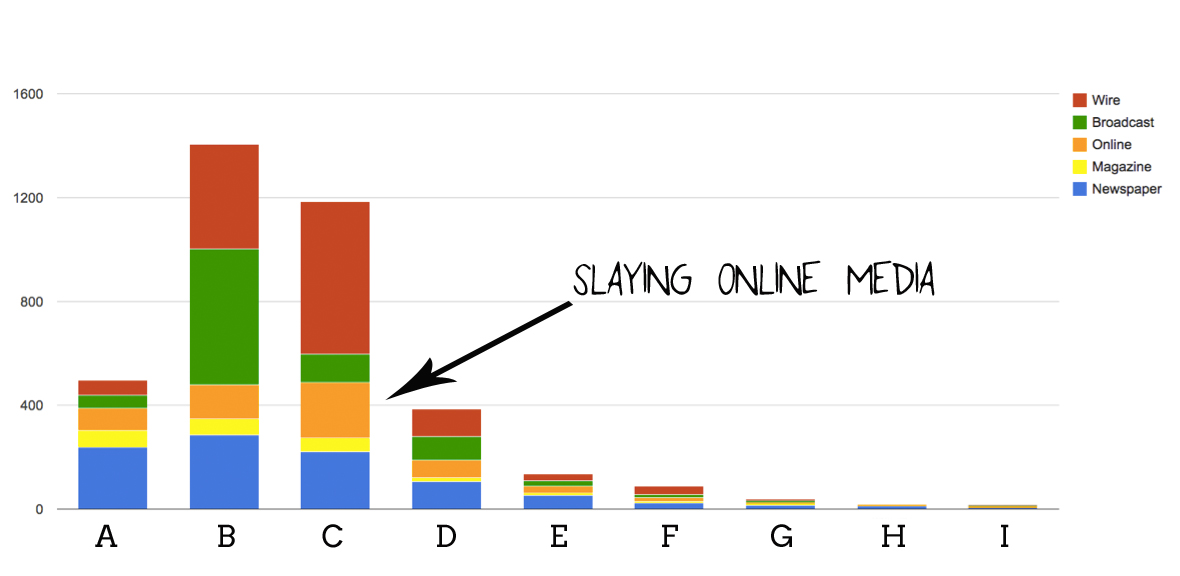
This first chart above tells us the proportion of the types of media hits the organizations received. So what do you do with that information? You look for opportunities.
Do you see how Organization A has about as many newspaper (blue) and magazine (yellow) hits in a year as Organization C does? But then look at Org C’s orange Online hits compared to Org A. Boom! Opportunity. Org C has about three times more presence in online outlets that are important to Org A’s audiences and goals.
Now we know that the story demand is there for Org A to step up its Online media results, Org A can make it a goal to develop the kinds of story angles and assets (videos, photos, charts) that make web reporters drool.
Let’s do another one…
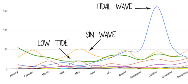
Mapping the media hits over time of multiple organizations like the wavy chart does above a) looks pretty sweet; b) shows you whether your organization was raising awareness for your cause at an important moment; and c) reveals the times in the year when your peers hit it out of the park and you fell behind (and vice versa).
Do you see how the green organization’s line dips in the spring and then comes back strong right in time for end-of-year fundraising? Do you see how the yellow organization’s line has a one-month-on, one-month-off sin wave that probably helps the organization’s press shop stay focused on one push at a time? Do you see how the blue organization’s line sees a spike of press coverage in October around the Ebola epidemic, which was a vital time for the group’s mission? Do you see how fun this chart is to analyze or is it just me?
Even if there was only one timeline on this chart, it’s still a valuable impact indicator for you to know. By understanding the pulse of your organization’s media hits (overall or on a particular campaign or message), you can see whether or not you’re making the most of key issue moments or sustaining the impact of your media hits month after month. If you aren’t, you’ve gotta adjust your outreach strategy.
Oh wait hey! Remember how at the beginning of this post I said we could all afford to be less numbers-oriented and then I proceeded to show you a bunch of number-y charts? Well, don’t fret. I stand by my words. Because what counts here is the story those numbers are starting to tell now that you’ve cut out the noise and can start to see the signals.
When we spend time and effort focusing on the media indicators and outlets that matter to our goals and forget about the rest, we have a better chance of finding the actual outcomes of our media results and shaping a media strategy that leads to even more support and change.
The answers to our 10 focused questions we asked before reading a single Oxfam America article were 10,000 times more useful than knowing the total number of media hits Oxfam America got last year.
Two important little asterisks…
*1 – We didn’t find these answers in an afternoon — we invented a new focused process, not a time machine. But we found them a helluvalot faster and richer than we would have if we had counted a thousand more media outlets.
*2 – Media auditing the Oxfam America way won’t tell you everything you’ve ever wanted to know. But as Dana Chinn, a professor at USC’s Annenberg School for Communication & Journalism told me recently when we were commiserating the state of media tallies: “By looking closer at key performance indicators, we can at least know more meaningful things than we did before.”
Take my advice: quit being satisfied with your oversized roll of media hits. It’s time to change the way you measure and then make media impact. Find the the answers to the questions that matter to you in the outlets that matter to your audiences. That’s how you’ll be able to assess the true value of your media results and develop a plan to grow that value — for real — next year.
Your #nonprofit media hits are important but there's a better way to measure impact! Quality over quantity, people. https://t.co/w4FadCtUz4
— M+R (@MRCampaigns) October 14, 2015