The results were surprising. The most profound thing we learned was that, for the most part, we did not find trends across organizations, we found trends within organizations. This was a good reminder of what we already knew – every organization is unique and must test for itself!
Even so, you might learn a thing or two from what we found. Check out the results of our testing blitz below… We hope it gives you some good ideas for what you should try on your own!
Can You Raise More By Asking For Very Little?
One idea we’ve been hearing a lot lately is that the “soft economy” is making donors and non-donors more likely to respond to lower-dollar asks. We felt it was time to put this assumption to the test and find out—does asking for less money actually improve fundraising results?
Asking For Radically Low-Dollar Amounts ($5 or $10) – We’ve all seen the $5 ask. Does it really work? The results were mixed…
- Sometimes it works: One of our clients tested an appeal with a $5 ask against an appeal that did not include a specific dollar amount to an audience of action-takers (people who’d taken at least one action in the last 10 months) who were not donors. The results were statistically significant: The $5 test group had a significantly stronger response rate than the control group. Although the average gift for the $5 test group was lower than that of the control group, the test group did give significantly more overall.
- But sometimes it doesn’t: A second client ran a similar test, splitting their non-donor audience into three groups and sending three appeals requesting a $5 gift vs. a $10 gift vs. no specific dollar amount. Although the test results were not statistically significant, the group that received the appeal without any mention of a dollar amount had the highest average gift and the most overall revenue. The $10 group had a slightly higher response, but given the drop in revenue, our recommendation for this client was not to use $5 or $10 asks in future email appeals.
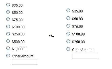
Using A Lower-Dollar Ask String – Do the amounts and the order of the amounts on a donation page make a difference? We took four organizations and tested their default ask strings on passive giving pages (pages not being promoted via email) against ask strings that had the same starting value but that topped out at $250 (as opposed to $500 or $1,000, etc.) and consequently had fewer gift choices to see if dropping the high-end amounts would increase overall giving. Here’s an example of what we tested:
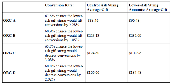
The results were inconclusive. See the details below: the tests measured an insignificant bounce in conversion rates for ORG A and ORG B, and an insignificant drop in conversion rates for ORG C and ORG D.
Our recommendation to these organizations was not to adjust their gift strings since the data was inconclusive and not statistically significant.
But remember – just because we found wish-washy results with these organizations doesn’t mean your organization’s results won’t be conclusive. You never know till you test!
Starting Below a Donor’s Highest Previous Contribution – We’ve repeatedly found that using a donor’s highest previous contribution (HPC) as the starting value for a fundraising ask works best, whether in the copy of an email appeal or in the gift string on a donation landing page. But last fall, we got tipped off about two cases in which large organizations with well-established fundraising programs found better results using 3/4 of their donors’ HPC as the starting point instead of the full HPC amount. We couldn’t wait to put this to the test! Here’s what we found out:
- 3/4 HPC vs. HPC on donation landing pages: For two clients, we tested starting the gift strings on donation landing pages with 3/4 of the donor’s HPC amount vs. the donor’s full HPC amount. The results for both organizations were similar—the lower gift string beginning with the 3/4 HPC amount raised less money overall, mostly due to a lower average gift. The response rates were nearly identical for both test groups in both organizations. Our recommendation to both clients was to use the full HPC to determine donor gift strings moving forward.
- 3/4 HPC vs. HPC in email appeal copy: We tested asking donors to give a gift of 80% of their HPC amount vs. making a gift of their full HPC amount in a stand-alone fundraising appeal email. Before we conducted the test, we assumed it would take at least two email appeals to be sure of the results. But after the first appeal, the discrepancy between the two segments was so great that we ditched the 80% HPC test and moved everyone into the full HPC group. The average gift for the 80% HPC test group was 25% lower than that of the full HPC test group without any real difference in response rates.
The test of this tactic for these two organizations did not increase donations. But we wouldn’t assume the same for other organizations. We encourage groups to test this for themselves.
Are Best Practices Always Best?
You’ve probably seen the case studies on multivariate testing: Change your “submit” button from small and grey to big and red and your conversion rate will go up by 25%! But does this mean YOUR organization should change its button to big and red? We thought it’d be useful to test some of these well-established best practices for online fundraising across several organizations to see if the aggregate results remained consistent. Surprisingly, there were a number of best practices that did not always work.
Using A Big, Brightly-Colored Donate Button – We ran a test between a big boldly colored donate button vs a small, modest-looking donate button for two clients and found that neither of these tests documented a discernable difference overall (either positive or negative), especially when we compared them to the results of similar tests we ran in 2007 and 2008. The big red button just didn’t seem to matter as much this year.
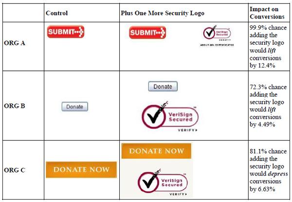
Including Additional Security Logos – An additional security logo might help ease the minds of donors who are nervous about transmitting their information online, making them more likely to give. We tested this theory for three of our clients by adding another security logo near the “submit” button on a donation form to see if it would improve conversion rates. The results were mixed – one organization found that the additional security logo had a statistically significant positive effect on their conversion rate, while the other two organizations did not find conclusive results either way (though one organization’s test results were actually trending negative).
This was the most surprising test we ran! Our gut feeling was that the trending negative impact seen in Organization C’s results had more to do with the placement of the security logo than with the fact that we’d included the logo itself. The results raised a lot of questions for us: Did the logo need to go to the right-hand side of the Donate button (like Organization A’s) instead of underneath it? Maybe the logo’s placement underneath the Donate button pushed down other important information for the donor, like the organization’s mailing address or other confidence-building page elements? Our recommendation for Organization C was to re-test with different placement before deciding that an additional security logo is a bad idea. For Organization A, the additional security logo was clearly working, so we recommended adding it. We also encouraged Organization B to test placing the logo to the right-hand side of the Donate button instead of underneath it to see if that would strengthen conversions. Knowing that the security logo had a potentially negative response on Organization C you should closely monitor this test as you roll it out.
Removing Donate Page Navigation – We intuitively know simpler is better when it comes to donation pages. So we were curious to see what impact, if any, removing or reducing navigation from donation pages would have – would less distraction keep donors focused on giving?
Of the four tests we ran, two had a statistically significant results; in those two tests, the elimination or reduction in donate page navigation lifted the conversion rate of the page by a jaw-dropping 53.7% and 28.9%, respectively. And while the results of the other two tests were not statistically significant, they trended positive:
These results support our theory that removing distractions from the donation page helps keep a donor focused on completing the transaction. Because two organizations showed a huge improvement by removing navigational elements, we feel comfortable recommending this tactic to smaller organizations who may not have the resources to test landing pages themselves.
What About Email Format: Do Images and Headers Help or Hurt? Another contentious best practice question is what the most effective email format is: Does it help or hurt to use a lot of images? And is it helpful or harmful to include a header on your messages?
We tested email formats for two clients around their year-end fundraising campaigns. Organization A tested an image-heavy format that was big on cool pictures and graphics and short on copy against their standard format that featured fewer images and more copy. Organization A found that the image-heavy format produced a lot more clicks, but the overall response wasn’t any different than their standard format.
Organization B tested whether or not removing the email header would help lift response rates to its fundraising appeal. They found no real difference in response rates between the email with a header vs. the one without a header.
What does this tell us? Email format may play a smaller role than many of us may think! (Though we intend to continue to test small format changes whenever possible with our clients).
What’s Next
As much as we all want one clear answer for what to do when it comes to online fundraising, different organizations have different audiences that don’t always respond the same way to “best practices.” The solution is always to create a strong testing program and to try these ideas out for yourself!
There are lots of other questions we’ll be testing in 2010, including the best way to retain new donors who responded to the Haiti crisis, how an organization can optimize its monthly donor program, and the best way to integrate social networking into advocacy campaigns. If you’d like to learn what we find out, you can sign up to receive M+R whitepapers via email at: www.mrss.com/whitepapers.html
QUESTIONS, COMMENTS?
If you have questions about this study, or if you would like to discuss your organization’s online fundraising strategy, please don’t hesitate to get in touch with us.


