 By Gwen Emmons
 Read time: 4 minutes
Your job is not to make a perfect ad; that’s already been done, back in the early nineties when the milk industry taught everyone about Aaron Burr. No, your job is to make an effective ad—one that distills your organization’s mission, theory of change, and call to action into one eye-catching, inspiring image/video/gif. An ad that gets clicks, drives action, raises money, inspires, and/or persuades.
The truth is, most non-profits don’t have the luxury of creating ads that just look good. Or make your Chief Marketing Officer happy. Or…merely extend your brand. Nope, most non-profits need to make the most of limited resources. After creating approximately 1,866,291 ads over the past year or so, we’ve got a pretty good idea of how to do it.
Focus.
You don’t have much space to play with in a digital ad, and the only thing you have less of than space is time. You’re trying to connect with people as they scroll through social media, read an article, or watch another cute puppy video on YouTube, so complicated messages are not possible.
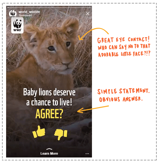
Good ads have focus. Copy is closely aimed at one story or message. Images have a central focal point. There is only one ask, and there ought to be no doubt about exactly what that ask is. A user should be able to notice, absorb, and understand an ad (or be so completely hooked they can’t look away) within a second or two.
Urgency.
Outside of M+R’s ad experts, no one is logging onto Facebook so they can look at some ads. Ads by their very nature are disruptive—they interrupt the user’s experience—and direct response ads are in an especially tough position. We are asking folks to stop doing the thing they are doing, think about something new we want them to care about, then go somewhere else to sign a pledge, take an action, or make a donation.
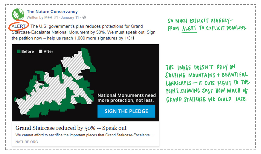
And we want them to do it right now. Which means we have to give them a very, very, good reason. Often, that reason comes down to urgency—that zomg-I-have-to-do-something-right-now-this-very-minute feeling. Urgency can be explicit (“DEADLINE: MIDNIGHT”) or implicit (“This child hasn’t eaten in days and she’s struggling to survive.”). One isn’t better than the other.
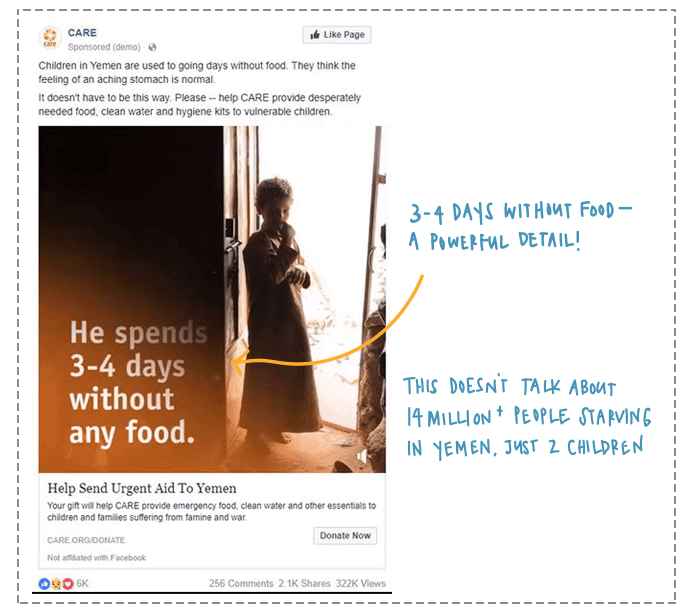
Specificity.
Specifics matter. Or maybe, one specific matters. When you’ve got a limited amount of space to fill in an ad, a single sparkling detail can make a line of copy or a simple image speak volumes.
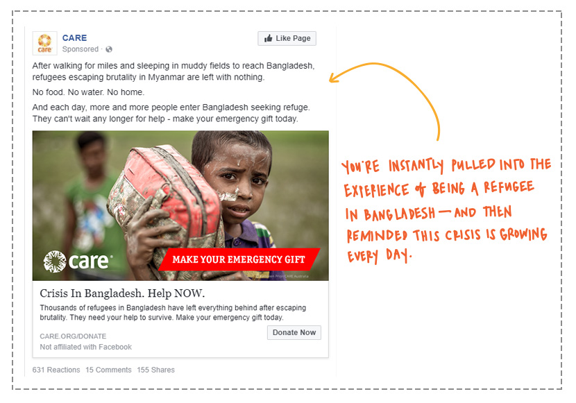
Specificity doesn’t mean simplicity though! Specificity makes things real. Tell the story of one child impacted by famine, not the larger crisis of millions of hungry people. Add one critical detail to your ad, whether it’s the name of that child or selecting an image where she is clinging tightly to her favorite stuffed animal.
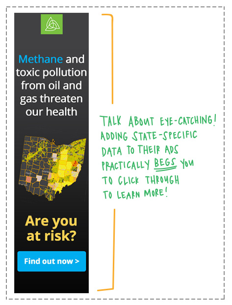
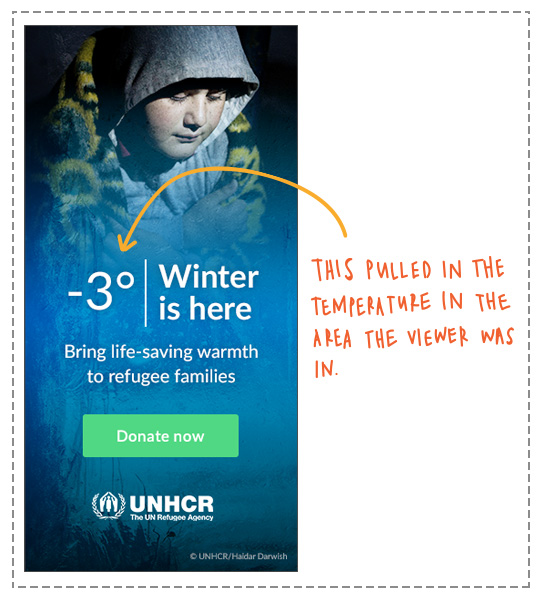
Relevance.
Put details about your supporters in there, too, to make your ad feel custom-tailored to the viewer (even though you’re serving it to millions of people).
Make a variant to previous donors asking them to come back and make another gift. Mention the state they live in. If they visited your donation form but didn’t make a gift, layer on the guilt relevance with a retargeting ad asking them to come back. All of these tactics have performed exceedingly well for our clients because they personalize your ad, compelling the viewer to act.
Directness.
Sometimes it’s the simple, no frills ads that work the best. Often in head-to-head testing, the clever, beautiful, compelling ads we create don’t beat a straightforward ad that just says “WE NEED YOU” with a big ol’ donation button at the bottom.
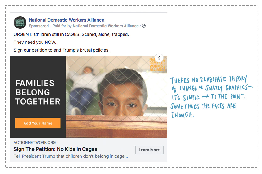
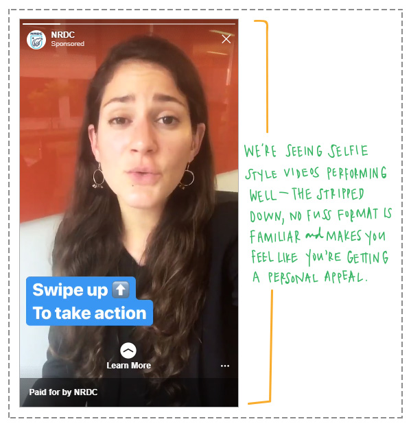
And just because the ask is front and center, that doesn’t mean you don’t have room to experiment and get creative. Test plain backgrounds against images, test an evergreen message against one that’s more à la minute, heck, test the use of caps. It’s not quite as sexy as a super slick HTML5 ad, but if it works, it works.
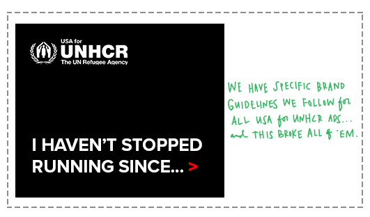
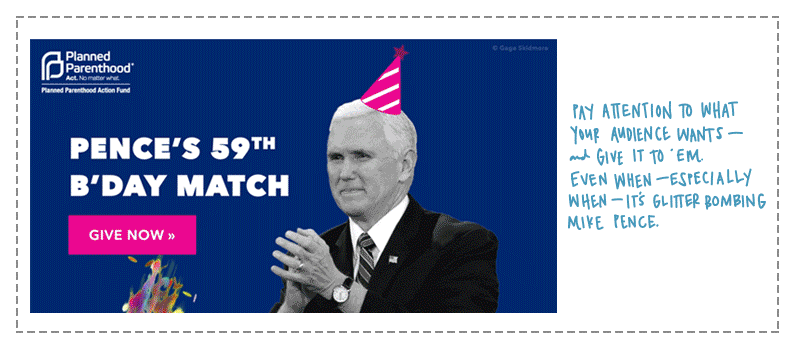
Something special.
Every once in a while, a clever new approach, a bold experiment, or just a fun gimmick manages to break through the cacophony of the online space. A robust ads program will follow the guidelines explored above for most content, while experimenting constantly to find these new creative opportunities. A good brainstorming sesh can help!
And we aren’t necessarily talking about outlandish, avant garde, off-the-wall creative. Just, a little something unexpected to help you make a splash. Dig into your brand guidelines and think about what you can break—whether it’s changing up the colors you use or adopting a new voice.
Happy creating! I can’t wait to stumble upon your creative and compelling ads the next time I’m browsing the New York Times or looking at a pug video on YouTube for “work research.”
————————
When Gwen’s not scheming up new campaigns or writing dazzling copy, she’s kicking it with her pug Frankie. You can reach her at gemmons@mrss.com.