If you’re a fundraiser, you probably poured your heart and soul into creating the best campaign possible last month. Hopefully, you did well. And maybe you’re just a tiny bit curious to see how things turned out for some of your peers?
We were. So we pulled together some top-line aggregate trends from the recent year-end giving season and compared them to last year’s data. The analysis that follows is based on aggregate data from 27 of our clients in 2011 and 2012.
What we saw this year boils down to this: Lists grew while response rates and average gifts stayed flat – so most groups raised more, both through email and other sources.
Here is a closer look at how things turned out:
Most raised more, but some raised less – In our 2011 end-of-year blog post, all the organizations we looked at raised more overall than they had in 2010. For this year’s cohort, it wasn’t as clean a sweep, but about 75% of the organizations we looked at did raise more in 2012 than in 2011.
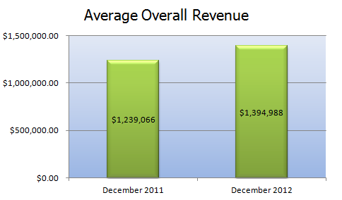
Overall, the groups raised a total of $37 million online in December, with a median of $376,000 and an average of almost $1.4 million. That’s about a 15% increase over what these groups raised last year.

More gifts – The number of gifts increased 16% for the collective group. 73% of these organizations saw an increase in the number of gifts while 27% saw a drop.
Flat average gift size – Unlike last year, where we saw a drop in the average gift, this year donors were giving the same size gifts as last year, on average.
Flat response rate – One of the brighter trends in 2011 was a rise in the response rate to email appeals. This year, the response rate stayed relatively flat year over year. While we would have loved to see an overall increase in response rate, we’re glad that the response rate at least stayed steady as list sizes grew, since annual fundraising response rates had been declining industry-wide until recently (for more on that, read the intro to our 2012 eNonprofit Benchmarks Study).
More emails sent – The volume of email went up a bit this year, though not as dramatically as in 2011. 33% of the groups included in this analysis sent more emails, 55% sent the same amount, and 12% actually sent fewer emails than in 2011. The average number of appeals these organizations sent in December 2012 was 5.85 while the average in December 2011 was 5.54.
In general, this seems like strong performance, even if it’s not quite as rosy as last year’s results.
When we looked for larger trends behind these numbers, we didn’t find any single factor that allowed some groups to grow their revenue while others decreased. It actually seems like performance between organizations varied more because of the differences in messages, tactics and strategies between organizations.
It’s also possible that some major events like Hurricane Sandy, the Newtown, CT shootings, and even the elections could have impacted how donors gave, and who they gave to, but there’s no way to ascertain their potential impact.
A deeper dive into the numbers…
Email revenue: We looked a little closer at revenue generated from email, specifically. The organizations for which we had data raised $9.8 million via email in December 2012, averaging $379,000 per group. On average, this is an increase of 5.7% over 2011 results. Email revenue constituted 20.85% of overall online year-end revenue in 2012, compared with 23.94% in 2011. So email revenue grew, but not quite as quickly as online revenue grew overall. 61% of the organizations in the sample saw increases in email revenue, while 39% performed worse than they had the previous year.
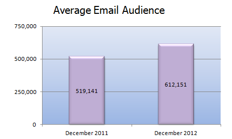
List size: Email lists were larger almost across the board, but were no more responsive than a year ago. Lists grew by 93,000 on average, and list growth was one of the major drivers of increased revenue. List sizes ranged from 21,000 deliverable addresses to 2.65 million. 92% of organizations for which we had data saw an increase from the previous year.

Response rates: Email response rates were basically flat, but this varied from group to group: 17% saw a higher response rate, 47% stayed the same, and 35% had a lower response rate. Even for organizations that saw a higher or lower response rate this year vs. last, the variance was small.
Open rates: In a bit of a surprise, open rates were mostly up, possibly due in part to the strong list growth. We know new names are sometimes more active, although that often depends on their source and join method. 14 organizations had a higher open rate in December 2012 vs. December 2011 and only 6 had decreased open rates. The average change was an increase of about half a point, and the median change was an increase of about three quarters of a point. This year’s median for all the open rates was 11.6%.

