
This is the best time of year—even *this* year. Longer days. Warmer weather. And…the M+R Benchmarks Study is out! Since I spend my days figuring out how to improve websites and donation forms, my favorite part of the study is the website analysis section, which includes some brand new data points this year.
Star light, star bright, how a visitor finds your site
There are many paths a potential supporter might take to your website. You can email a link to sign a petition. You can target their newsfeed with donation ads and the big red CLICK HERE TO GIVE button. You can pay for placement at the top of the Google or Bing results. And then there are those users who find you organically, most often by typing a few words into Google and clicking on one of millions of search results.
Users from different channels are coming to your site with different expectations. Most of the time, we practice outbound marketing, where we interrupt the experience of the user with content they either did or did not ask for, like in ads or email. These are direct, active, often highly targeted measures—and when a user decides to click through those links, they carry with them some sort of expectation of what the landing page will look like and ask of them since they are responding to a direct call to action.
Organic Search traffic is fundamentally different, because those users are coming to a site all their own in search of an answer to a question, which we can consider inbound marketing. These users comprise a lot of people who find you.
Think about your own behavior. When you are trying to shed light on a subject, when you have a problem and are looking for solutions, when you have a question about just about anything in the universe, what’s the first thing that you do? That’s right: you pull out your phone and you Google it.
That’s why we study Organic Search traffic and how well nonprofits connect with searchers—specifically, how they are transforming those curious, answer-seeking visitors (who are mostly new to the organization) into donors.
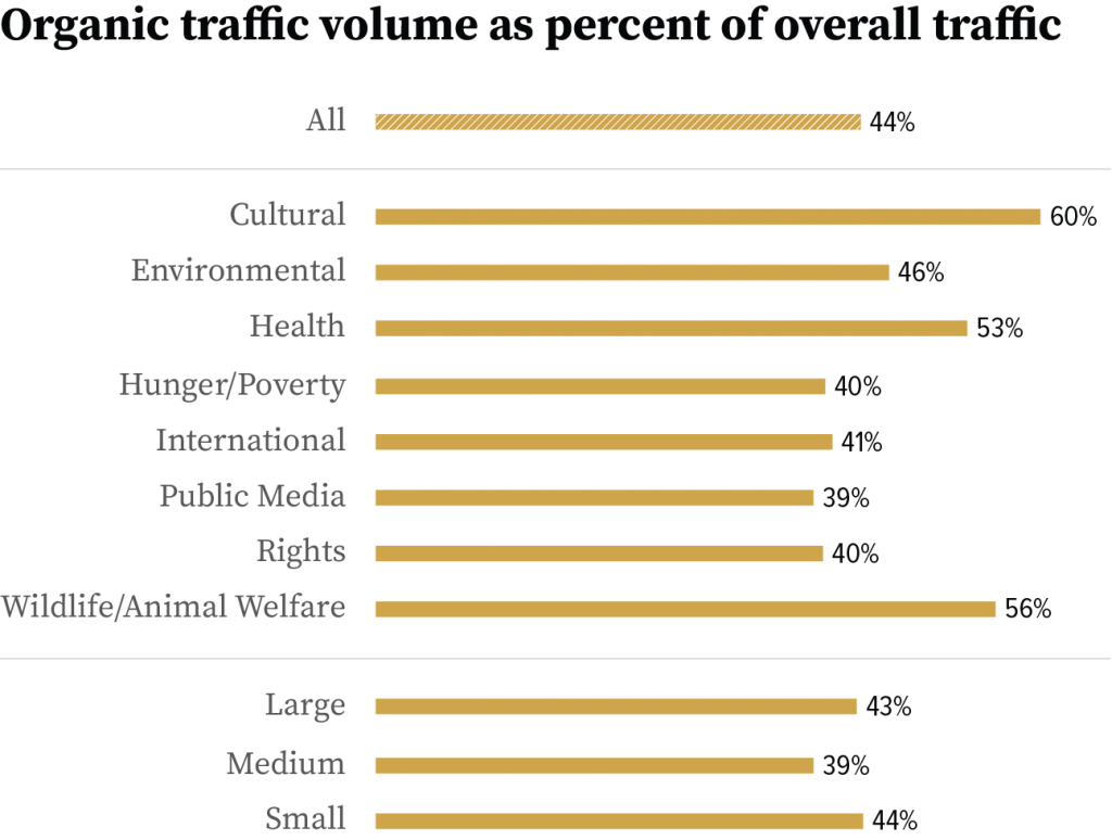
In 2019, organic traffic comprised 44% of all visits to nonprofit websites. Nonprofits that produce a lot of content, like health groups, or have a local, physical presence (such as a museum) see even more of their traffic coming from organic search; for cultural groups, a whopping 60% of all visitors come by way of a search engine, and for wildlife and animal groups, that number is 56%. It’s common to see that percentage even higher, since we’re talking about the median group here.
Nonprofits’ success in attracting traffic from organic search is a reflection of what nonprofits have to offer: a unique blend of current event news and problem-solving prowess, two factors that Google and SEO experts recognize as influential to search results.
But what happens once people arrive? Very often, they’re not donating. Overall, 1 in every 588 organic website visitors (or 0.17%) made a donation, generating an average of $0.30 per visitor.
Even knowing that people visit nonprofit websites for many reasons (seeking services and doing homework are two big ones), we see a huge opportunity in these figures. How are we welcoming visitors? What are we asking them to do once they’ve arrived? How can we build a relationship with them, quickly enough to grab their attention (and their email address) so we can engage them later, while still being respectful of their initial intent for visiting?
This is where testing helps. Free tools like Google Optimize or paid tools like OptinMonster or Unbounce can help nonprofits install and test some of these relationship-building strategies, since there is no one-size-fits-all to engaging organic visitors.
Finding your metrics to compare to Benchmarks
In order to see data on the performance of your website, you first need to have tracking set up on the website. There are free tools available to do so, including Google Analytics or Adobe Analytics, with most groups using Google Analytics.
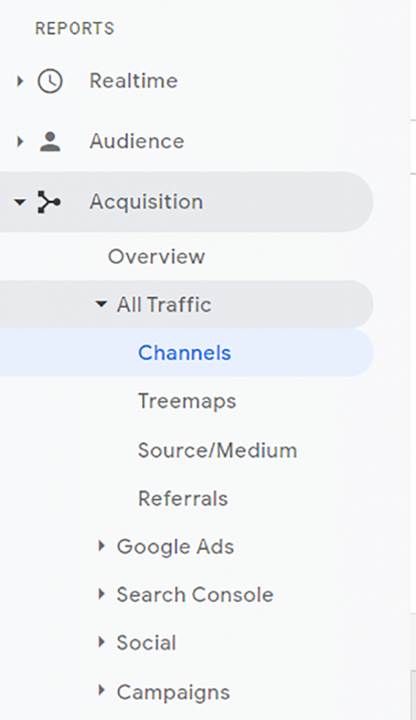
To find traffic by channel in Google Analytics, login and navigate to the “Acquisition” section of the reporting, select “All Traffic” and then “Channels.” This will show you how your traffic is coming to your website, based on Google’s default channel definitions. (Sidebar: If you’re not seeing Email as its own channel, chances are you’re not utilizing utms correctly!)
If you have eCommerce tracking enabled, you’ll be able to see how many visitors arrived at your site via each channel, how many of those users donated while they were there, and how much they gave. The small percentage inside the parentheses in the users and sessions columns indicates what proportion of total traffic resulted from each channel.
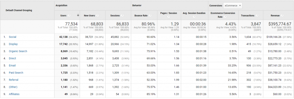
To calculate your conversion rate for each channel, take the number of donations and divide that by the number of users. So, for this nonprofit, their organic search conversion rate for this time period would be 0.61%. To calculate revenue per visitor, take the amount in each channel and divide it by users in that channel. For this nonprofit, that number would be $1.71.
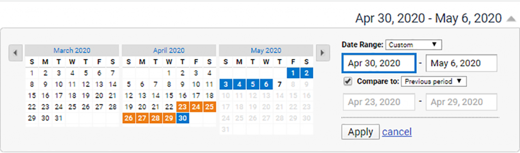
If you want to compare this number over time, or change the date range you’re examining, you can utilize the date range functionality in the top right corner of the report.
Bonus round: If you’d like to see what pages are attracting your organic search visitors, click through the Channel Grouping report to see “Landing Pages.” This is what Google calls the page where a user enters your site, and if they’re coming from Organic Search, it was the page that appeared in their search results that grabbed their attention. The higher the pageviews, the more you should be paying attention to how you’re welcoming users to your website on those pages.
Houston, we have a portable communication device
Mobile phones have been on the rise for literally decades, but the role they play in U.S. nonprofit fundraising is only just beginning to pick up. In previous iterations of the Benchmarks Study, we reported that many users are visiting websites on their phones, but very few were donating, and those who were giving weren’t giving as much as users on other devices.
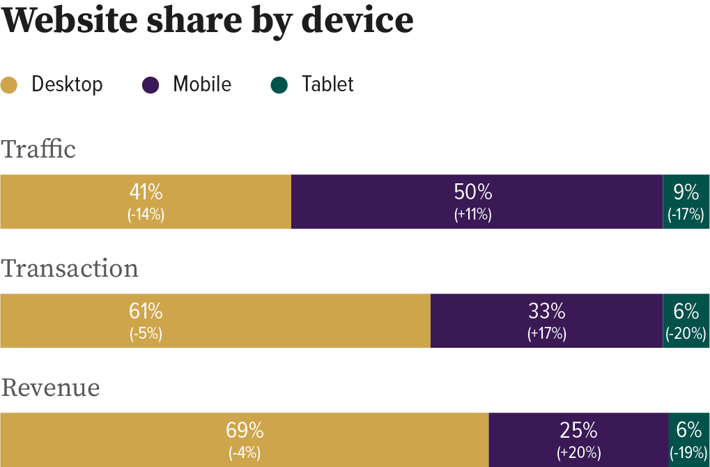
That’s changing! In 2019, mobile users made up half of visits, they accounted for a third of donations, and a quarter of revenue.
Mobile behavior is also shifting dramatically; over the past year, the share of traffic generated by mobile users was up 11%, while the share of donations increased by 17% and the share of revenue jumped by 20%. So, not only are more people visiting on mobile, but they’re also giving more frequently and giving larger gifts than they were before.
This is also a reflection of nonprofits’ diligent work to prioritize the mobile experience and make it easier and more efficient to give via mobile devices, utilizing payment methods such as Apple Pay and Paypal Express.
Finding your own numbers
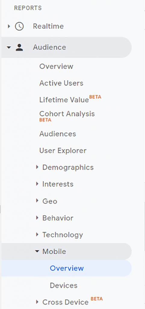
Going back to Google Analytics, we’ll be looking at the Audience section of the report. From there, scroll down to “Mobile” and click “Overview.” Congratulations, you’re now looking at the breakdown of all users and what device category they’re using. Google defines desktop as any desktop or laptop larger than 7,” mobile is a handheld device that includes a phone, and tablet is everything else.
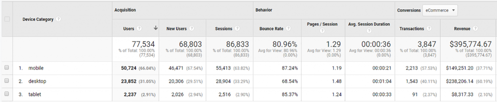
Similar to the channel report, the percentages next to the user, transaction, and revenue counts will indicate what percentage of the total is on each device, which you can then compare to Benchmarks.
If you’re looking for simple ideas to up your mobile optimization game, start by making a donation on your own nonprofit’s website on your phone. Better yet, ask your curmudgeonly friend or spouse. Ask them: What makes it easy or hard to navigate? Are there things about the form fields that make it difficult to input information on the fly? Are there payment options that allow you to pay via thumbprint instead of digging out a credit card and painstakingly typing in every number, which almost always results in a typo and frustrating error sequence? All of these areas are ripe for testing and optimization—and here’s a guide for getting started.
For now, desktop users are more likely to donate than mobile users. For now, the average gift from a desktop donation dwarfs that of a mobile donation. For now. Next year, those mobile numbers are going up. Here’s to yours going up with ‘em!